RG

Met Office

Weather App

An intuitive Web App to check the weather using the Met Office's API.

Project Screenshot Placeholder

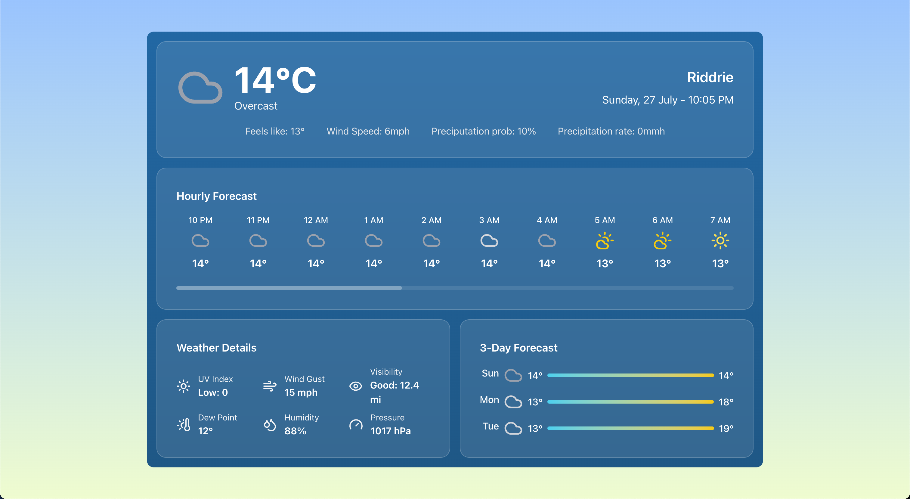
Met Office | Weather App UI Screenshot

Project Overview

This project involved designing an intuitive UI for a weather forecast web application that uses the Met Office's API to provide real-time weather information. The application features automatic geolocation detection, dynamic weather icons, and a user-friendly interface, making it easy for users to check the weather conditions in their local area.

Built with React, the interface communicates with the back end's API via https requests (visit Full Stack API for more details). It also incorporates best practices in software development, including version control with Git and deployment on Azure.

As the sole creator, I was responsible for all aspects of the project, from initial concept and design to development, deployment, and maintenance.

Key Features

Responsive Design

The app is designed to be responsive, ensuring a seamless experience across all devices, including desktops, tablets, and smartphones.

Key Outcomes

Real-time Data

The application provides real-time data updates, ensuring that users always have the most current information at their fingertips.

Automatic Geolocation Detection

The app automatically detects the user's geolocation, providing personalized content based on their location.

Responsive Design

The app is designed to be responsive, ensuring a seamless experience across all devices, including desktops, tablets, and smartphones.

Dynamic Icons

Weather conditions are displayed with dynamic icons, enhancing the user experience with visually appealing graphics.

Technology Stack

languages

JavaScript HTML/CSS Python YAML

libraries

Lucide FastAPI React Pydantic Uvicorn Requests

frameworks

Vite TailwindCSS

tools & platforms

VS Code Git/GitHub GitHub Actions GitHub Secrets Azure

Development Journey

Creating an intuitive and user-friendly interface that allows users to easily navigate through the application and access the information they need was a significant challenge. The goal was to ensure that the application was not only functional but also visually appealing and easy to use. This involved designing a layout that was both aesthetically pleasing and practical, ensuring that users could find what they were looking for without confusion.

Solution: Modular Design and Dashboard Layout

To address this challenge, I implemented a modular design approach, breaking down the application into smaller, manageable components. This allowed for a clean and organized layout, making it easier for users to navigate. The dashboard layout was designed to provide quick access to key features and information by grouping them logically and intuitively, with the most immediately relevant information displayed at the top, enhancing the overall user experience. Additionally, I incorporated responsive design principles to ensure that the application looked great on all devices, from desktops to mobile phones.
Handling dynamic data from multiple external APIs and interpreting it correctly for display in the application was a significant challenge. The goal was to ensure that the data was not only accurate but also presented in a way that was easy for users to understand and interact with. This involved parsing complex data structures, managing different data formats, and ensuring that the information displayed was relevant and useful to the user.

Solution: Creating codemaps for Data Parsing and Display

I developed codemaps to define the structure and relationships of the data being handled. This approach allowed for more efficient parsing and transformation of the data, ensuring that it could be displayed in a user-friendly manner. By mapping out the data flows and dependencies, I was able to create a more intuitive interface that guided users through the information presented. This not only improved the accuracy of the data displayed but also enhanced the overall user experience by making it easier for users to find and understand the information they were looking for at a glance by displaying the most intuitive icons and complementing information alongside the data such as UV Index meaning and levels of visibility.
Ensuring that the application provided real-time data updates while maintaining high performance was a critical challenge. The goal was to create a responsive application that could handle multiple API calls without lagging or crashing, providing users with the most up-to-date information at all times.

Solution: Implementing Asynchronous Data Fetching

To achieve this, I implemented asynchronous data fetching using FastAPI and React. This allowed the application to make multiple API calls simultaneously without blocking the main thread, ensuring that the user interface remained responsive. Additionally, I optimized the data processing algorithms to minimize response times and improve overall performance, allowing for quick updates to the displayed data without compromising on speed or reliability.
Creating a responsive design that worked seamlessly across different devices and screen sizes was a significant challenge. The goal was to ensure that the application provided a consistent user experience, regardless of whether users accessed it from a desktop, tablet, or smartphone. This involved designing a flexible layout that could adapt to various screen sizes and orientations, ensuring that all features were accessible and functional on any device.

Solution: Utilizing Tailwind CSS for Responsive Design

I utilized Tailwind CSS to implement a responsive design that automatically adjusted the layout based on the device being used. This framework allowed for easy customization and rapid development of responsive components, ensuring that the application looked great on all devices. I used different browser developer tools to test and refine the design for a wide variety of screen sizes and orientations, allowing me to create a flexible and adaptive design that provided a consistent user experience across different platforms and screen sizes. This approach not only improved the usability of the application but also enhanced its visual appeal, making it more engaging for users.